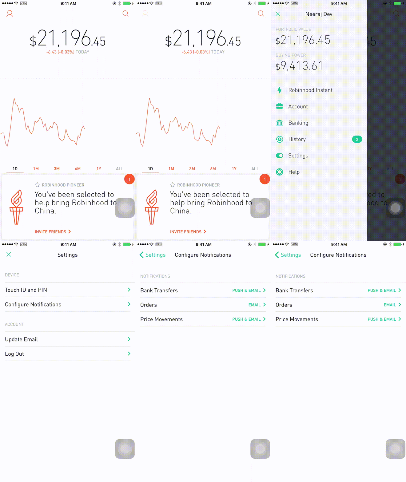
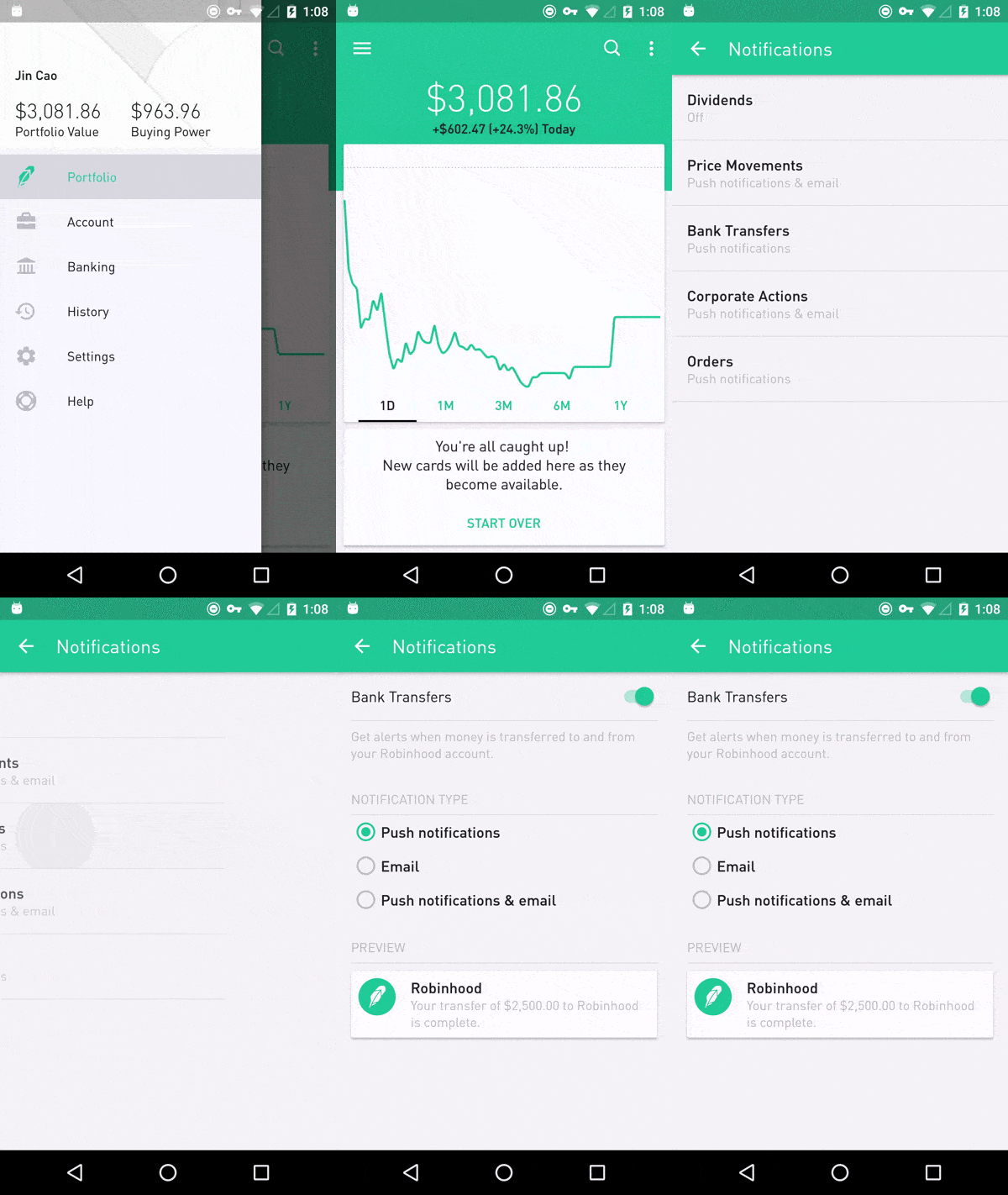
Robinhood is an industry leading app that teaches you to invest in the stock market, Robinhood Crypto, or how to trade options for free. The app is built for a younger generation of investors reluctant to pick up the phone for a broker, offering a stripped down overview of one’s portfolio.
Many people have noticed discrepancies between iOS and Android versions of the renowned trading app. Unfortunately, it seems as though Android users have gotten the short end of the stick yet again. However, we should point out that the app was primarily released on iOS and secondarily on Android. The differences are mainly seen in the aesthetics rather than functionality. Let’s take a look at some of the contrasting features.

In regards to design, there are only a couple variations between the two mobile apps. The iOS version has a consistent background color whereas the Android version incorporates a green chunk of space behind the homepage. In addition, the stock graph line has a heavier stroke weight on the Android version. These subtle differences make the Android design look slightly clunky in comparison to iOS.
Users will notice that the iOS version has slightly smoother scrolling through the interface. Furthermore, opening up individual stocks on the Android app takes slightly longer to load than the iOS version. The difference isn’t large, but it’s certainly noticeable.

In regards to functionality, there are just a few UI details missing from the Android app that users can find on the iOS version. One of them is the small add-on that indicates level of volatility for individual stocks. This is a slight disadvantage because Android users will not see this visual cue, even though there are other ways of determining volatility than merely relying on this “high” or “low” indicator.
Another feature that’s supposed to be located just underneath volatility is buying power. This lets you know how much money is left in your account to buy additional stocks, options or crypto, and is seen only on the homepage menu in Android’s version. This is a nice feature to have in terms of account transparency, but again, isn’t absolutely essential to a user’s experience. Lastly, there’s the portfolio diversity indicator that allows users to see what percentage of their account is in a certain stock or asset type. Useful? Sure. Imperative? Not exactly.

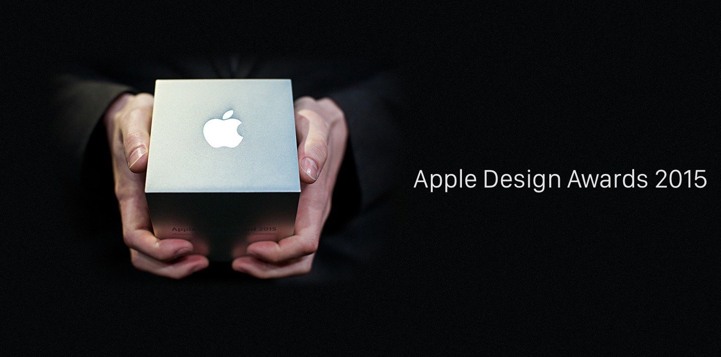
In 2015, the iOS Robinhood app won the Design Award at Apple’s Worldwide Developer Conference. The Android version wasn’t released until 9 months after iOS, but it’s been nearly three years since and iOS is still the winner. The user experience for both operating systems is remarkable, but you have to wonder when Android’s design will catch up, if at all.
Thanks for reading!
If you’d like to learn more about tech and the latest trends, check out our other posts and subscribe to receive weekly blog updates. To inquire about any custom application design or development, please contact us.