With thousands of apps being submitted to the app store on a daily basis, the need to make your mobile app stand out among the giant crowd is becoming more and more important. The best way to catch the eye of the average app store customers is to have a flawless design that attracts users day in and day out. While you may think designing for mobile apps is easy, many designers and developers continue to make these 5 common mistakes when it comes to mobile app design.
1.Failing to focus on user experience
The number 1 mistake when it comes to creating a design for a mobile app is failing to put enough focus on the end user. People tend to forget that they are the reason why you are developing the mobile app in the first place.
Often times, designers get caught up in their own realities putting more emphasis on their own preference rather than focusing on the customers who will actually be using the app.

To combat this mistake, it is best to take a user-centered approach when it comes to designing for mobile apps. A user-centered approach consists of carefully taking the time to understand who your user is and what their specific needs are. This will help you create a seamless user interface that your end users will love the second they engage with the mobile app.
2. iOS to Android
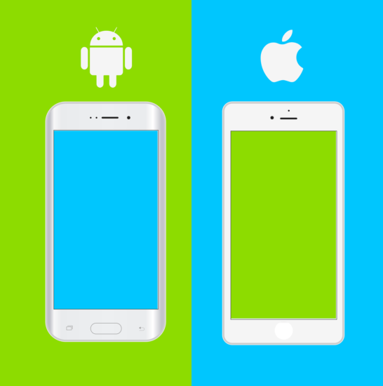
iOS and Android each have their own design patterns that create a different experience across the different platforms. What might work on the Apple iOS system for an iPhone user might be confusing for users on the Android platform.

It doesn’t necessarily mean you have to completely change the mobile app design between the two systems. It just means don’t be lazy. It is important to pay attention to each platform’s interface guidelines to ensure you have the best user experience no matter if it is on the iOS or Android platform.
3. Failing to adhere to the budget and timeline
We want you to be a perfectionist when it comes to the mobile app design, but it is just as important that your work follows the proposed budget and timeline of the project that is set ahead of you.
The longer the mobile app is delayed, the higher the chances are that your mobile app is no longer relevant or competitive on the app store.
It is also important to keep in mind the complexity of the design and the predicted functionalities as it may result in longer development time that could put you past your timeline and go over the budget for your company.
4. Complex/Overcrowded Mobile App Design
You have to remember that phones are small. There is only so much you can put on the screen before it is overcrowded and frustrating to the user. Yes, you might be an artist, and have designed something truly amazing, but at the end of the day, users are looking for simplicity.

They want to be able to complete the objective your mobile app was created for with just the touch of a finger. In this case, less is more, as it helps the user navigate throughout the interface with ease without getting lost. The more design housed on the screen can create distractions that could block users from completing their intended objective resulting in frustration with the overall mobile app.
5. Designing without proper Feedback
You might think what you have created is a masterpiece. Maybe it is, but if you don’t receive the appropriate amount of feedback, it is impossible to deliver the perfect user experience.
Feedback can come from anyone even if they are not a designer. There is value to hearing critique on your work as it allows you to flesh out small mistakes you might have missed in the design process. Setting the up a the appropriate channel for feedback can ensure your mobile app design is ready for the app store.
THANKS FOR READING!
We hope you enjoyed this article on mobile app design. We at Seamgen want to help make sure you don’t make these mistakes or any others when it comes to mobile app design. Feel free to email us your questions at hello@seamgen.com.
Check out some of our other related posts in the meantime!
A Brief History of User Experience Design
Combining Design Thinking and User Experience
The Problem UX Design Will Face with the New iPhone X